Show multiple entity states, attributes and icons on entity rows in Home Assistant's Lovelace UI






NOTE: This is not a standalone lovelace card, but a row element for the entities card.
Requires Home Assistant 2024.4 or newer.
Manually add multiple-entity-row.js
to your <config>/www/ folder and add the following to the configuration.yaml file:
lovelace:
  resources:
    - url: /local/multiple-entity-row.js?v=4.6.1
      type: module
OR install using HACS and add this (if in YAML mode):
lovelace:
  resources:
    - url: /hacsfiles/lovelace-multiple-entity-row/multiple-entity-row.js
      type: module
The above configuration can be managed in the Configuration -> Dashboards -> Resources panel when not using YAML.
This card produces an entity-row and must therefore be configured as an entity in an entities card.
A visual editor is available: when editing a custom:multiple-entity-row row through the entities card's UI editor, the row opens a form-based editor with tabs for the main entity and each additional entity (add / reorder / copy / paste / delete), plus sections for secondary info, state-based icons, per-entity custom CSS, and tap/hold/double-tap actions. Everything below can still be configured in YAML; a few advanced options (hide_if, digit-suffixed formats like precision5) are YAML-only.
| Name | Type | Default | Description |
|---|---|---|---|
| type | string | Required | custom:multiple-entity-row |
| entity | string | Required | Entity ID (domain.my_entity_id) |
| attribute | string | Show an attribute instead of the state value | |
| name | string/bool | friendly_name |
Override entity friendly name |
| unit | string/bool | unit_of_measurement |
Override entity unit of measurement |
| icon | string | icon |
Override entity icon or image |
| icon_color | string | CSS color for the entity icon | |
| state_icon | object | Map of state value → icon override | |
| image | string | Show an image instead of icon | |
| toggle | bool | false |
Display a toggle (if supported) instead of state |
| show_state | bool | true |
Set to false to hide the main entity |
| show_state_first | bool | false |
Show the main state before other entities |
| state_header | string | Show header text above the main entity state | |
| state_color | bool | false |
Enable colored icon when entity is active |
| column | bool | false |
Show entities in a column instead of a row |
| default | string | Display this value when the state is hidden | |
| hide_unavailable | bool | false |
Hide the state value if unavailable |
| hide_if | object/any | Hiding | Hide the state value if criteria match |
| styles | object | Add custom CSS styles to the state element | |
| format | string | Formatting | Format main state/attribute value |
| entities | list | Entity Objects | Additional entity IDs or entity object(s) |
| secondary_info | string/object | Secondary Info | Custom secondary_info entity |
| tap_action | object | Actions | Custom tap action on entity row and state value |
| hold_action | object | Custom hold action on entity row | |
| double_tap_action | object | Custom double tap action on entity row |
Similarly as the default HA entities card, each entity can be specified by an entity ID string,
or by an object which allows more customization and configuration.
If you define entities as objects, either entity, attribute or icon needs to be specified. entity is only required if you want
to display data from another entity than the main entity specified above. attribute is necessary if you want to display an entity
attribute value instead of the state value. icon lets you display an icon instead of a state or attribute value
(works well together with a custom tap_action).
| Name | Type | Default | Description |
|---|---|---|---|
| entity | string | A valid entity_id (or skip to use main entity) | |
| attribute | string | A valid attribute key for the entity | |
| name | string/bool | friendly_name |
Override entity friendly name (or false to hide) |
| unit | string/bool | unit_of_measurement |
Override entity unit of measurement (or false to hide) |
| toggle | bool | false |
Display a toggle if supported by domain |
| icon | string/bool | false |
Display default or custom icon instead of state or attribute value |
| state_color | bool | false |
Enable colored icon when entity is active |
| icon_color | string | CSS color for the entity icon | |
| state_icon | object | Map of state value → icon override | |
| default | string | Display this value if the entity does not exist or is hidden | |
| hide_unavailable | bool | false |
Hide entity if it is unavailable or does not exist |
| hide_if | object/any | Hiding | Hide entity if its value matches specified value or criteria |
| styles | object | Add custom CSS styles to the entity element | |
| format | string | Formatting | Format entity value |
| tap_action | object | Actions | Custom entity tap action |
| hold_action | object | Actions | Custom entity hold action |
| double_tap_action | object | Actions | Custom entity double-tap action |
default also shows when the entity is hidden by hide_unavailable or hide_if, not only when it is missing.
Some special data fields from HA can be displayed by setting the attribute field to the following values:
| Value | Description |
|---|---|
last-changed |
Renders the last_changed state of the entity if available |
last-updated |
Renders the last_updated state of the entity if available |
The secondary_info field can either be any string if you just want to display some text,
an object containing configuration options listed below, or any of the default string values from HA
(entity-id, last-changed, last-updated, last-triggered, position, tilt-position, brightness).
| Name | Type | Default | Description |
|---|---|---|---|
| entity | string | A valid entity_id (or skip to use main entity) | |
| attribute | string | A valid attribute key for the entity | |
| name | string/bool | friendly_name |
Override entity friendly name (or false to hide) |
| unit | string/bool | unit_of_measurement |
Override entity unit of measurement (or false to hide) |
| hide_unavailable | bool | false |
Hide secondary info if its entity is unavailable |
| hide_if | object/any | Hiding | Hide secondary info if its value matches given criteria |
| format | string | Formatting | Format secondary info value |
This card supports all the default HA actions. See Lovelace Actions for more detailed descriptions and examples.
| Name | Type | Default | Description |
|---|---|---|---|
| action | string | Required | more-info, toggle, call-service, url, navigate, fire-dom-event, none |
| entity | string | Override entity-id when action is more-info |
|
| service | string | Service to call when action is call-service |
|
| service_data | object | Optional data to include when action is call-service |
|
| url_path | string | URL to open when action is url |
|
| navigation_path | string | Path to navigate to when action is navigate |
|
| confirmation | bool/object | false |
Enable confirmation dialog |
| haptic | string | none |
Haptic feedback (success, warning, failure, light, medium, heavy, selection) |
The format option supports the following values:
| Value | Type | Description |
|---|---|---|
| relative | timestamp |
Convert value to relative time (5 minutes ago) |
| total | timestamp |
Convert value to relative time (5 minutes) |
| date | timestamp |
Convert timestamp value to date |
| time | timestamp |
Convert timestamp value to time |
| datetime | timestamp |
Convert timestamp value to date and time |
| brightness | number |
Convert brightness value to percentage |
| percent | number |
Multiply a fraction value by 100 and append % (0.25 -> 25 %) |
| duration | number |
Convert number of seconds to duration (5:38:50) |
| duration-m | number |
Convert number of milliseconds to duration (5:38:50) |
| duration-h | number |
Convert number of hours to duration (5:38:50) |
| invert | number |
Convert number from positive to negative or vice versa |
| kilo / kilo<0-9> | number |
Divide number value by 1,000 (ex. 1500 -> 1.5) |
| mega / mega<0-9> | number |
Divide number value by 1,000,000 (ex. 2500000 -> 2.5) |
| milli / milli<0-9> | number |
Multiply number value by 1,000 (ex. 0.2 -> 200) |
| position | number |
Reverses a position percentage (ex. 70% open -> 30% closed) |
| precision<0-9> | number |
Set decimal precision of number value (precision3 -> 18.123) |
| celsius_to_fahrenheit | number |
Converts a Celsius temperature to its Fahrenheit equivalent |
| fahrenheit_to_celsius | number |
Converts a Fahrenheit temperature to its Celsius equivalent |
| upper | string |
UPPERCASE the value |
| lower | string |
lowercase the value |
| capitalize | string |
Capitalize the first letter of the value |
| title | string |
Title Case Each Word Of The Value |
kilo/mega/milli on their own default to a maximum of 2 decimal places. Suffix a digit (kilo3, mega1, milli0, ...) to request an exact decimal precision instead, the same way precision<0-9> does.
None of kilo/mega/milli/invert/position change the displayed unit — they only scale or transform the number. If you want the unit label to match (e.g. W -> kW), set unit: explicitly alongside the format:
- entity: sensor.power_usage
  type: custom:multiple-entity-row
  format: kilo
  unit: kW
Numeric formats can be combined comma-separated — the value flows through each in turn and is formatted once at the end. An explicit precision<N> controls the decimals wherever it appears; otherwise the last format's own default applies:
format: invert, precision3   # -18.123
format: kilo, precision1     # 1500 -> 1.5
format: invert, kilo3        # 1500 -> -1.500
Only number-transforming formats compose (brightness, percent, invert, position, kilo/mega/milli, precision, temperature conversions) — durations, timestamps and text transforms cannot be combined. In the visual editor, pick Custom… in the Format dropdown to enter a combined format.
The hide_if option can be used to hide an entity if its state or attribute value matches the specified criteria.
It can be used directly with a string, number or boolean value (i.e. hide_if: 'off'), as a list with several values,
or as an object with one or more of the options listed below.
| Name | Type | Description |
|---|---|---|
| above | number | Hidden if entity number value is above the specified value |
| below | number | Hidden if entity number value is below the specified value |
| value | list/any | Hidden if value matches specified value or any value in a list |
| entity | string | Evaluate the criteria against this entity instead of its own |
| attribute | string | Evaluate the criteria against this attribute's value |
For example, only show the alarm exit-state sensor while the alarm is armed:
- type: custom:multiple-entity-row
  entity: switch.dsc_armed_away
  toggle: true
  entities:
    - entity: sensor.dsc_exit_state
      hide_if:
        entity: switch.dsc_armed_away
        value: 'off'
hide_if and hide_unavailable at the top level hide the main entity's state value (the row itself stays visible); default is shown in its place when set.
icon_color accepts any CSS color value (red, #ff0000, var(--my-color)) and applies it to the entity's icon. state_icon maps state values to icon overrides, taking precedence over icon when the current state matches:
- entity: binary_sensor.front_door
  type: custom:multiple-entity-row
  icon_color: 'var(--accent-color)'
  state_icon:
    'on': mdi:door-open
    'off': mdi:door-closed
  entities:
    - entity: binary_sensor.back_door
      icon: true
      icon_color: red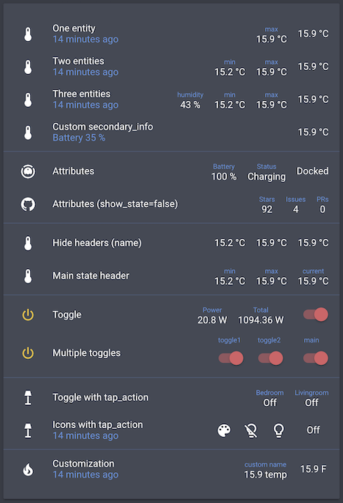
type: entities
entities:
  - entity: sensor.bedroom_temperature
    type: custom:multiple-entity-row
    name: One entity
    secondary_info: last-changed
    entities:
      - sensor.bedroom_max_temp

  - entity: sensor.bedroom_temperature
    type: custom:multiple-entity-row
    name: Two entities
    secondary_info: last-changed
    entities:
      - sensor.bedroom_min_temp
      - sensor.bedroom_max_temp

  - entity: sensor.bedroom_temperature
    type: custom:multiple-entity-row
    name: Three entities
    secondary_info: last-changed
    entities:
      - entity: sensor.bedroom_humidity
        name: humidity
      - sensor.bedroom_min_temp
      - sensor.bedroom_max_temp

  - entity: sensor.bedroom_temperature
    type: custom:multiple-entity-row
    name: Custom secondary_info
    secondary_info:
      attribute: battery_level
      name: Battery
      unit: '%'

  - type: section
  - entity: vacuum.xiaomi_vacuum_cleaner
    type: custom:multiple-entity-row
    name: Attributes
    entities:
      - attribute: battery_level
        name: Battery
        unit: '%'
      - attribute: status
        name: Status

  - entity:  sensor.lovelace_multiple_entity_row
    type: custom:multiple-entity-row
    name: Attributes (show_state=false)
    show_state: false
    entities:
      - attribute: stargazers
        name: Stars
      - attribute: open_issues
        name: Issues
      - attribute: open_pull_requests
        name: PRs

  - type: section
  - entity: sensor.bedroom_temperature
    type: custom:multiple-entity-row
    name: Hide headers (name)
    entities:
      - entity: sensor.bedroom_min_temp
        name: false
      - entity: sensor.bedroom_max_temp
        name: false

  - entity: sensor.bedroom_temperature
    type: custom:multiple-entity-row
    name: Main state header
    state_header: current
    entities:
      - sensor.bedroom_min_temp
      - sensor.bedroom_max_temp

  - type: section
  - entity: switch.livingroom_tv
    type: custom:multiple-entity-row
    name: Toggle
    toggle: true
    state_color: true
    entities:
      - entity: sensor.livingroom_tv_power
        name: Power
      - entity: sensor.livingroom_tv_power_total
        name: Total

  - entity: switch.livingroom_tv
    type: custom:multiple-entity-row
    name: Multiple toggles
    state_header: main
    toggle: true
    state_color: true
    entities:
      - entity: switch.livingroom_light
        name: toggle1
        toggle: true
      - entity: switch.livingroom_light_2
        name: toggle2
        toggle: true

  - type: section
  - entity: light.living_room
    type: custom:multiple-entity-row
    name: Toggle with hold_action
    state_header: Livingroom
    toggle: false
    hold_action:
      action: toggle
    entities:
      - entity: light.nightstand
        name: Bedroom
        tap_action:
          action: toggle

  - entity: light.living_room
    type: custom:multiple-entity-row
    name: Icons with tap_action
    secondary_info: last-changed
    entities:
      - entity: light.living_room
        icon: mdi:palette
      - icon: mdi:lightbulb-off-outline
        state_color: true
        tap_action:
          action: call-service
          service: light.turn_off
          service_data:
            entity_id: light.living_room
      - icon: mdi:lightbulb-outline
        state_color: true
        tap_action:
          action: call-service
          service: light.turn_on
          service_data:
            entity_id: light.living_room
          confirmation:
            text: 'Are you sure?'

  - type: section
  - entity: sensor.bedroom_temperature
    type: custom:multiple-entity-row
    name: Customization
    icon: mdi:fire
    unit: °F
    secondary_info: last-changed
    entities:
      - entity: sensor.bedroom_max_temp
        name: custom name
        unit: temp

  - type: section
  - entity: sensor.bedroom_temperature
    type: custom:multiple-entity-row
    name: Styles
    styles:
      width: 80px
      text-align: right
    secondary_info:
      attribute: battery_level
      styles:
        font-weight: bold
    entities:
      - entity: sensor.bedroom_max_temp
        styles:
          width: 80px
text-align: leftThe color of entity headers (the small name above each value) can be overridden with the
--multiple-entity-row-header-color CSS variable, either from a theme or per entity via styles:
entities:
  - entity: sensor.bedroom_max_temp
    styles:
'--multiple-entity-row-header-color': redyarn install
yarn build # lint + type-check, run tests, then bundle multiple-entity-row.js
yarn test # run the unit test suite
yarn coverage # run tests with a coverage reportThe codebase is migrating incrementally from JavaScript to TypeScript: .ts and .js coexist (allowJs), Babel strips types during bundling, and tsc --noEmit type-checks as part of yarn lint. New code should be TypeScript; existing modules migrate opportunistically when touched.
To test changes against a real Home Assistant instance, a disposable local testbed is available via Docker:
yarn ha:up      # first run also creates .dev/ha-config from the example
# → HA boots at http://localhost:8130 (~1 min on first start)
# → onboard a throwaway user, then add a card of type: custom:multiple-entity-row
After editing source and running yarn build, hard-refresh the browser to pick up the rebuilt bundle. See yarn ha:down, yarn ha:logs, and yarn ha:reset for managing the testbed.
xiaomi-vacuum-card |
multiple-entity-row |
github-entity-row |
battery-entity-row |
attribute-entity-row